HFB
Hindu Forum of Belgium
Ancient roots. One voice. Unstoppable future.
Client
The Hindu Forum of Belgium is the official representative body of Hindu communities in Belgium. Since 2007 it has acted as a bridge between Hindu organisations, institutions and society, fostering dialogue and cohesion. Its guiding principle is unity in diversity.
Brief
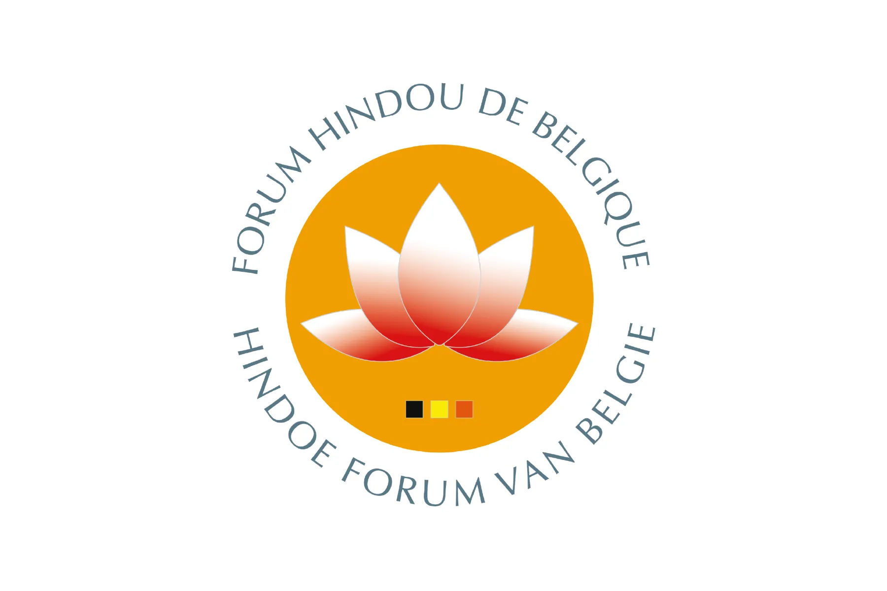
The old logo felt dated and heavy: gradients, bright colours and a crowded composition robbed it of clarity and authority. The task was to modernise the identity while keeping the lotus, with a cleaner, stronger visual system.
Creative process
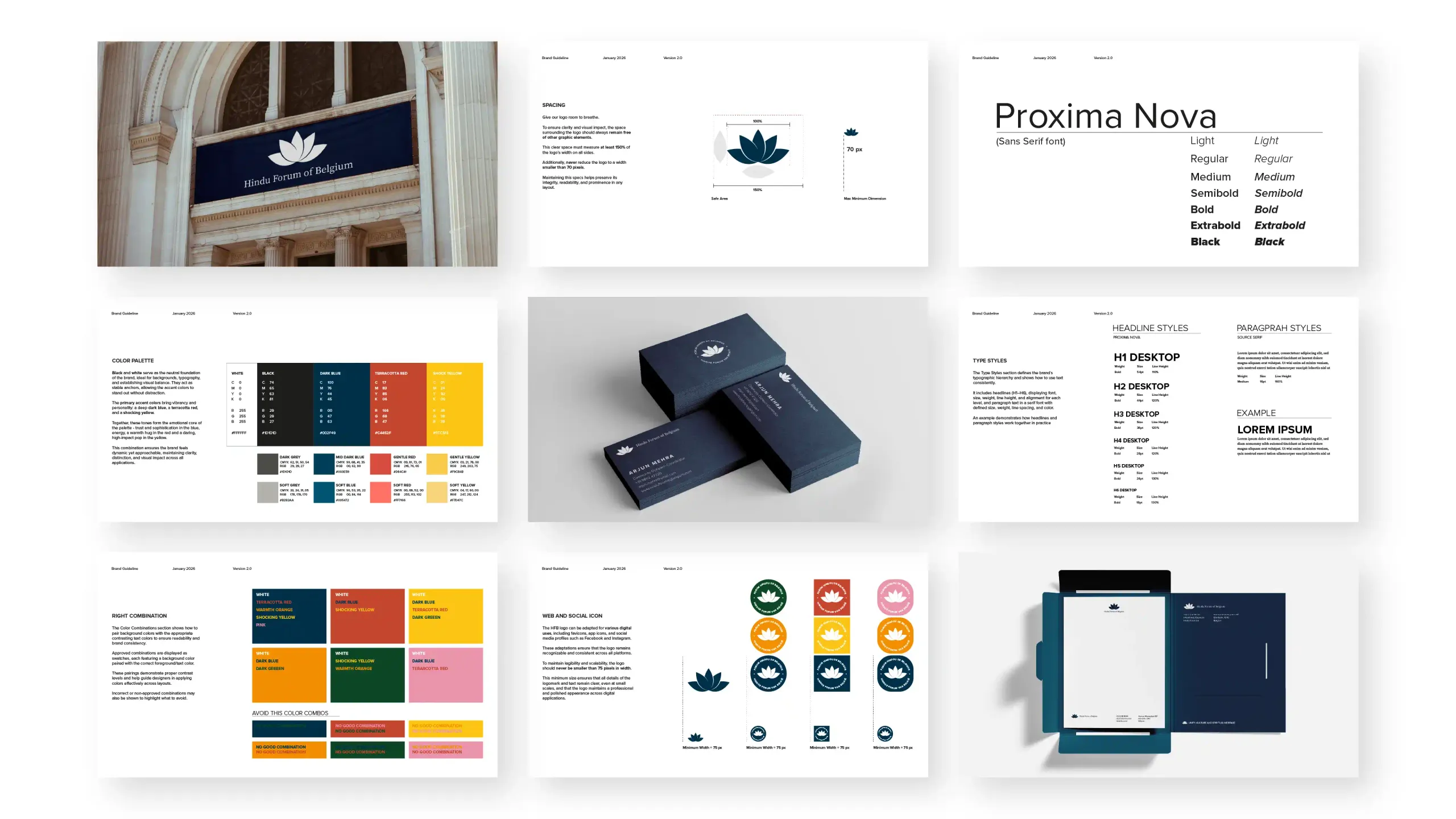
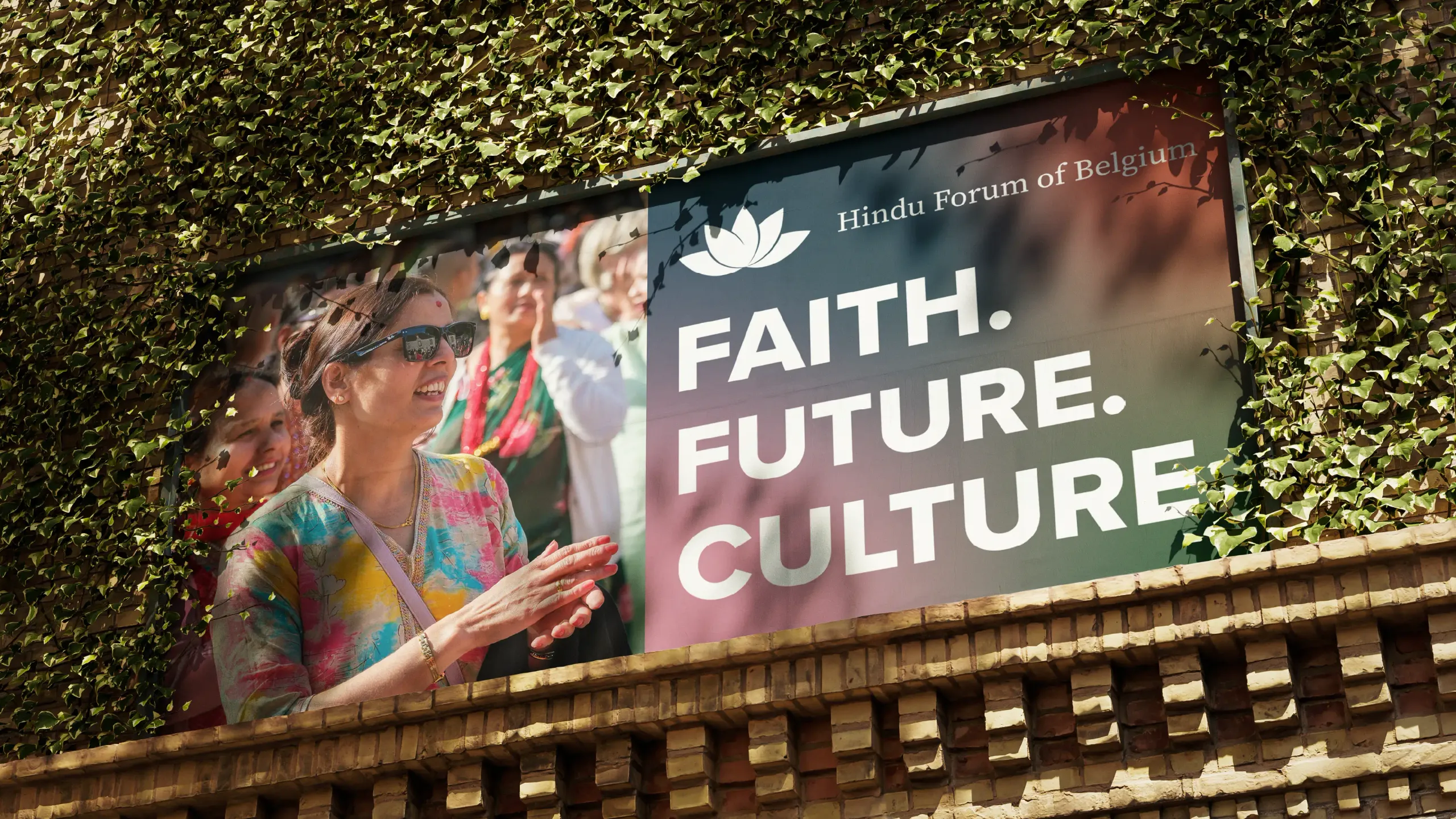
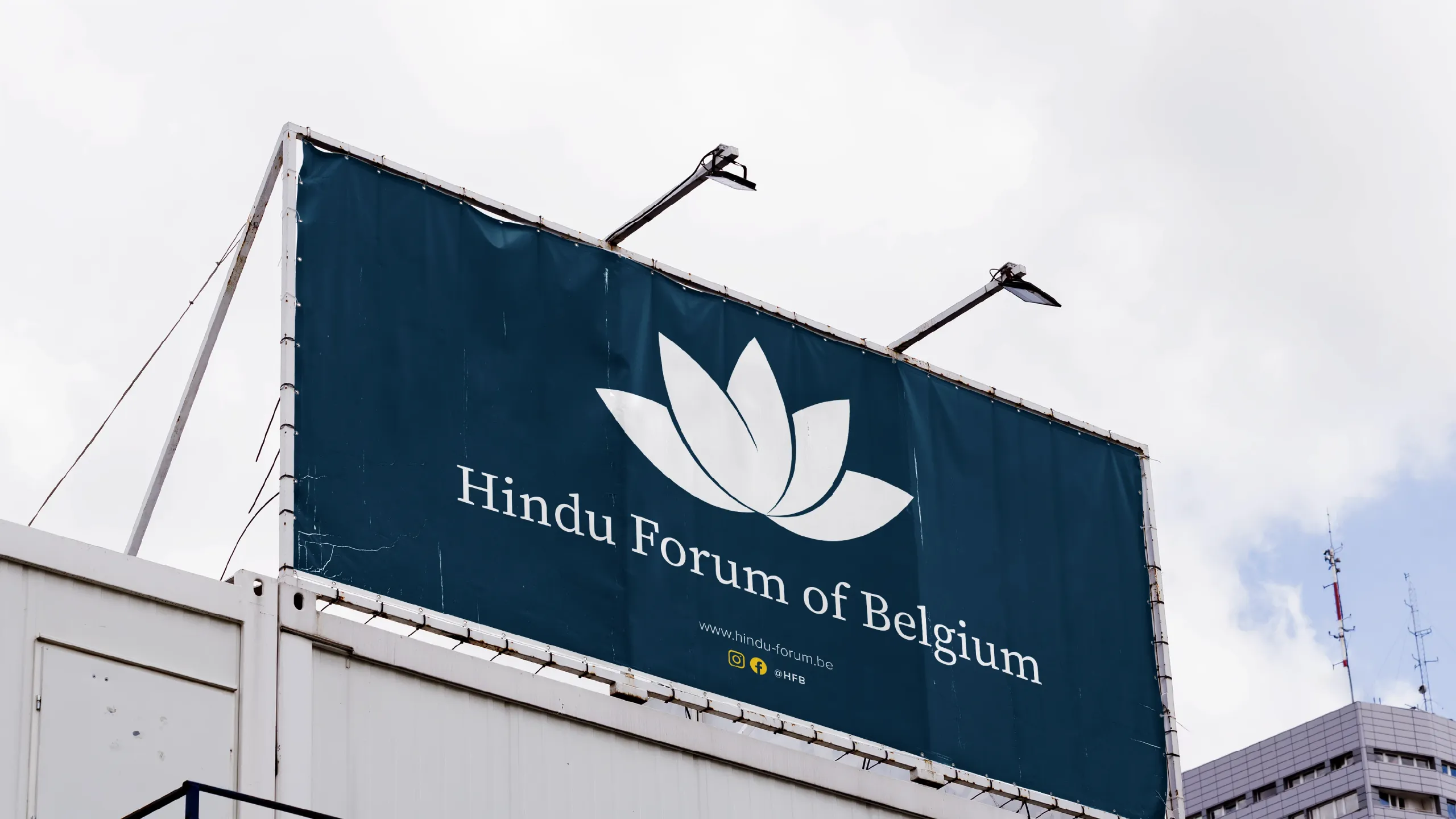
I rethought the identity as a whole, starting from the lotus: a sharper, more balanced mark, free of gradients and badges, with more room to breathe. Around it I built a coherent system: a deep monochromatic palette, modern typography that sits harmoniously in both French and Dutch, and understated communication. The result is an authoritative, inclusive identity, rooted in tradition and firmly contemporary.

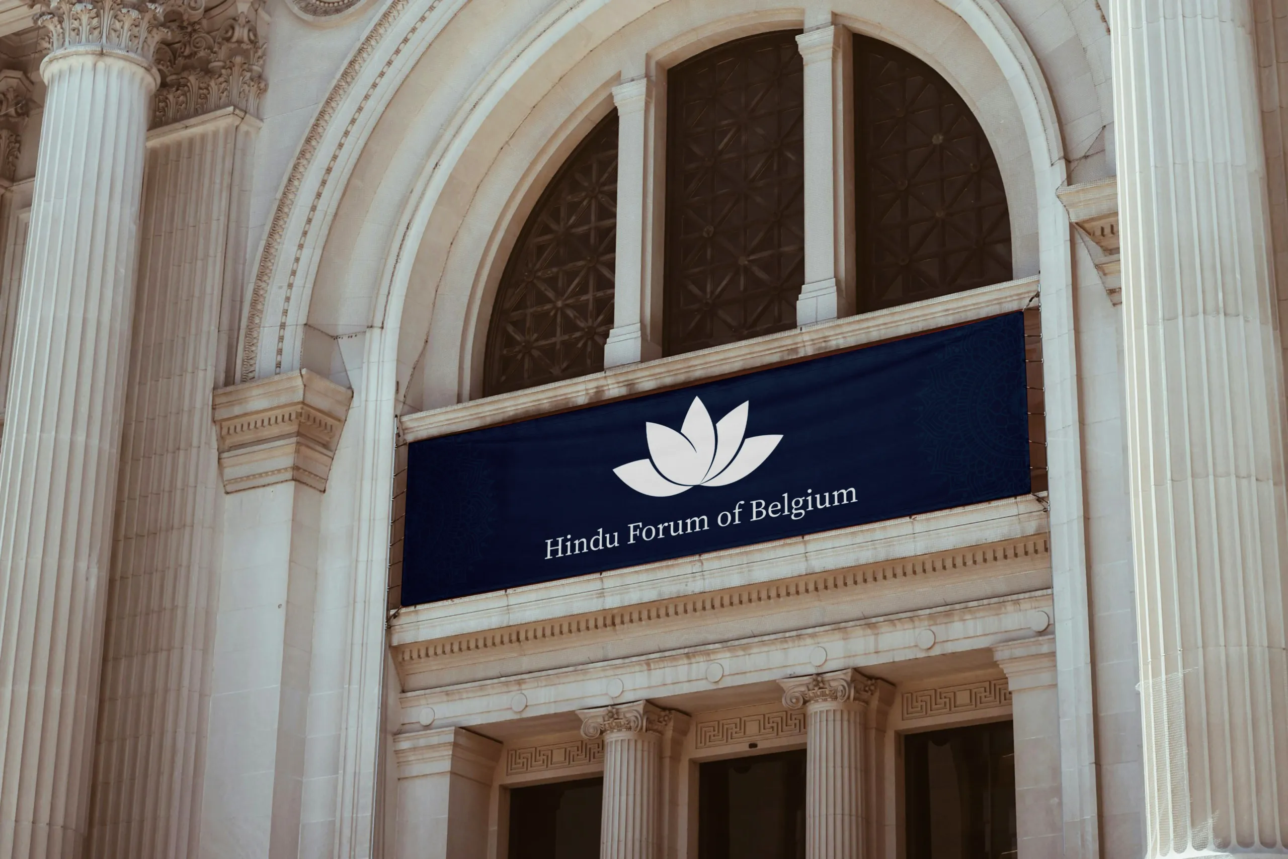
The lotus remains the central figure, shedding its gradients and unnecessary elements to take on a clean, symmetrical and balanced form.
Dark blue is the primary colour; around it, a palette of full, warm tones lets the brand shift register while always remaining recognisable.
The brochures bring the new system onto paper: a shared grid, adapted into three languages and the colours of the palette, for every community.
Same cover, changing colour: French, Dutch and English can be told apart at a glance, yet they all speak with the same voice.